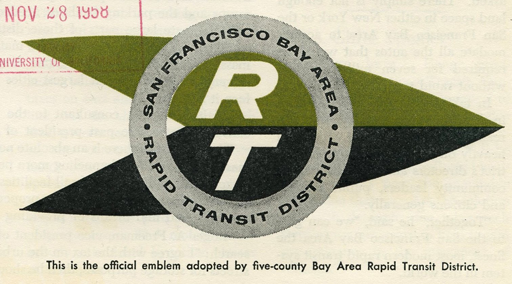
In today’s news roundup at Streetsblog SF we spotted this, the original BART logo circa 1958. The image comes to us courtesy Eric Fischer, who’s flickr stream is full of bay area transit gems old maps and early BART plans.

In today’s news roundup at Streetsblog SF we spotted this, the original BART logo circa 1958. The image comes to us courtesy Eric Fischer, who’s flickr stream is full of bay area transit gems old maps and early BART plans.
Comments are closed.
The old BART logo is nice, but the eventual design, like the Muni worm and the Golden Gate Transit ended up being much better iconography, immediately recognizable as the symbol of the agency as well as representative of the areas they serve (in the case of GGT and Muni).
That is fricking Awesome!! Did Gene Roddenberry rip that off for Star Trek? 🙂